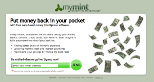
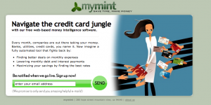
I was browsing my old files and came across these original landing pages Jason and I worked on to start getting users pre-launch.
The purpose of these pages was to collect users pre-launch and also test different marketing messages to see which were the most effective in converting users.


You can see the rest here: https://okdork.com/mint/?i=1 (check out others: 2,3,4,5,6)
Which do you think was the most effective?
ps. Notice we were called mymint.com before (:

29 responses to “Original Mint.com Landing Pages”
It has to be #6 for me. #1 can be the second in line. The others don’t have a headline consistent with the copy.
I think it’s a great headline with a cutesy design – I’m sure UXers will grade it highly whilst not opting into the offer, which is… weekly tips?
Not a very good bribe – IMHO… and that comes from an ideal target (likely in need) of Mint’s core offering. LOL
the one on the left
i want to know more
I am looking for marketing tips and really love your post! As an immigrant, starting my own Chinese learning books publishing, I have many challenges in marketing. Your post helps me a lot and I will be your fan! I am now!:-) Thank you! Enjoy such a wonderful and smart article!
Thank you so much!
Different strokes for different folks, working in social media more nowadays than actual film, the quirkier, and more humorous the ad, the better the response, keep up the great work. 🙂
Hi Noah,
What was your traffic source?
Do you have the old ads/banners that you used?
Curious to see what the framing was before arriving on landing page.
Cheers,
Hey JJ,
You’ll find it here https://okdork.com/quant-based-marketing-for-pre-launch-start-ups/
Noah, thanks for sharing these landing pages / screenshots.
I also purchased your Mint.com Marketing plan previously from App Sumo.
We are currently designing a site to compete in the growing Peer to Peer Lending space. EveryLoan.com
We chose the AOR for Lending Tree as our web development and marketing agency.
Initially we will be partnering with existing Peer to Peer lenders to provide loans to consumers. Eventually we want to grow into becoming a Peer to Peer lender managing our own portfolios and loans as a direct lender.
However we are still struggling to find a key differentiator or develop a distinct competitive advantage for our company. i.e. What makes us different?
(The website you see at the URL is merely a placeholder until we launch the new site.)
EveryLoan,com will become a valuable consumer resource for 3 main loan categories.
Home Loans – Business Loans – Personal Loans.
Under each loan category are different loan verticals that include – Student Loans – Auto Loans – Pay-day Loans etc…
Everyloan.com will provide news, information, tools and funding sources for a variety of loan categories –i.e. “Every Loan”
Do you have any ideas that could help set us apart from the crowd?
Sincerely,
Sam Stamper
EveryLoan.com
sstamper@everyloan.com
I would have guessed 1 or 5. Both sell the direct cash benefit. 5 is probably a little better because the $2000 sticks out more than “money in your pocket” but I also can see how the photo made a difference. Interesting post Noah!
Love that you are showing the iterations to the site. Can we get the various CTR?
I like #1’s headline best, but I think it needs a graphic in the style of #6 – with a big assed wodge of money being shoved into her pocket.
Did you guys tested different landing pages to know which features to build before even creating the landing pages where the features are the same and just the title and messaging are different?
How early in the process did you guys start generating content?
Its amazing to see how the product has developed. Thanks for sharing Noah
Thanks for sharing real examples. Very helpful in brainstorming our own messaging tests.
From you and Jason’s comments, it sounds like quite a few of these messages resonated with folks – do you recall how that was translated from these tests into other marketing collateral?
Did you for instance use just one message on your early homepages? Multiple?
What sort of things were pointing people to the site? The blog? Social Media? Promotions? Ads?
I like #5. But I’m gravitating toward #6 as the best.
Thanks for sharing!
YES! Test, test, test…..and as I recall they all worked pretty well……
#5 performed best followed by #6.
I’m guessing 5 was the most effective. Can’t wait to find out what the answer is and why.
I actually don’t remember the winner. Maybe Jason doe…
So curious… 7 years of suspense lol
I just came upon this post (good post by the way), and I can say that it would be really nice to know which was the winner. Any chance you could come up with that datum?
Weird that a few years ago I would have totally tuned-out the pic of the mom & baby, but now it garners a second look. Also, the empty pockets babe seems so “DUDE me and my college buddies are doing a start-up DUDE!” But…I’m biased.
Yea, we were curious which groups would garner the most responses. There are college, parents, young professionals, women and a few more in there…
Denny,
I wrote a post: https://okdork.com/2008/06/03/startup-tips-how-i-grew-a-waiting-list-of-20000-at-mintcom-part-i/
and Jason wrote a post: https://jasonputorti.com/post/472866002/how-mint-com-acquired-1-5m-users
I’ll add more color to it later…
Glad you’re back Noah.
Do you remember what you learned from all those mymint tests?
Images of women work well and people have different preferences in messaging. Some people are more focused on knowing all details about there money while others want ways to optimize it.
How did you attract pre-launch users?