A few days ago, my friend Neville wrote a tweet about how I “split tested” my way to the color of the cover for Million Dollar Weekend.
In this email, I want to dive deeper into how we used testing and data to iterate our way to the current cover (and how you can use the same principles for your business).
Let’s dive in…
1- Finish Strong
Whether we want to believe it or not, people DO judge a book by its cover. And if they never pick up your book because the cover sucks, they’ll never get to the good stuff inside.
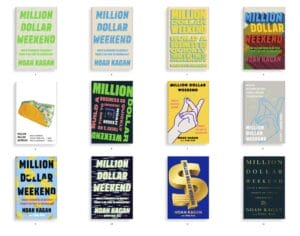 Early renditions of the cover
By the time my publishers sent me 50 book covers to review, I had already spent years writing and rewriting the contents of the book. We were getting close to launch, and it would have been easy to just pick one of the covers provided.
But my mother always told me to “finish strong” – you always forget how hard you ran after the race is over. Last lap matters most. Why work so hard on your product, only to not do the marketing?
When I spoke with James Clear, he told me that he tested 300 different book covers. 300!
So I knew that it was essential to have everything–the title, subtitle, color, font, and graphics–dialed in.
2- Test, Test, then Test Some More
The easiest way to improve your business is to ASK. You can do it with data and you can do it qualitatively with customer opinion. Testing should NOT replace you making decisions but inform better decision making.
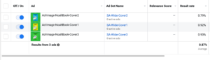
We set up inexpensive campaigns in Facebook ads by running them in affordable countries. In total, we spent $377 on 7.8M impressions that garnered 50k clicks ($.007 a click), targeting men aged 18-65 in China, India, and Singapore who speak English.
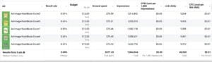
Initial Facebook ad test results
Then we looked at the clickthrough rate for each cover. The covers that performed the best included the ‘snapping fingers’ graphic, Million Dollar Weekend with a golden ticket, and Million Dollar Weekend with a calendar.
Next, we tested our top results against each other in 5 more iterations of the ad test. The ‘snapping fingers’ graphic won with a 0.83% clickthrough rate. Nice!
3- ‘Broken Door Problem’
I felt confident about using the ‘snapping fingers’ graphic and liked that it represented taking action quickly. But there was a lot more to consider, like the subtitle, and background color.
For a long time, the subtitle was “Build a business so quickly there’s no time to chicken out.” Sometimes when something in your life has been the same for a while, it’s easy just to leave it as it is. I call this the ‘Broken Door Problem.’ But I’ve found that the best entrepreneurs stay curious and wonder if things can improve.
So I did a poll on both Twitter and my email newsletter, testing different variations.
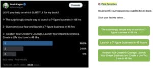 Twitter and email polls on the subtitle
The clear winner in both polls was “The surprisingly simple way to launch a 7-figure business in 48 hours.” This is what ended up on the final version. You don’t need a large audience to do these tests – the whole point is to TEST so you can use some insights on making better decisions.
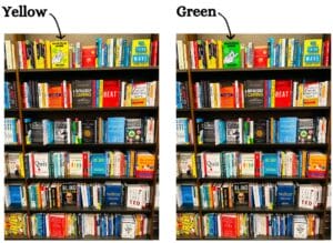
Next, I wanted to decide the color for the book.
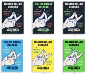
Different color options
We used ads again to test. This time, the covers were the same, it was just a difference in color. We tested black, blue, yellow, and green. Thank you Nick Christensen and Top Growth Marketing for helping setup all the FB tests.
Tested the top colors in ads
We tested a few times to make sure. After 1M impressions, yellow actually came out on top, but there wasn’t a significant difference between yellow and green. So I made the call to choose green because it’s the color I’ve used on my blog for years.
4- Look through the eyes of your customer
When I told my publisher I wanted to choose green, they didn’t think it was a good idea. They said green is bad luck (who knew?) and that we’d be the only green book in the business category.
That made me double take. Being different is scary. It meant it could either go really well or really poorly.
While making my book a bright green might have been a riskier move, when we placed the mockups against all the other business books on the bookshelves, green really popped.
What stands out more in bookstores?
These mockups affirmed my decision. Even when we did a mockup of the book on Amazon, it was clear that the green was the right decision.
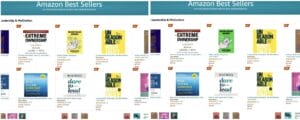
Mockup on Amazon, yellow versus green
5- SIZE matters
One last tweak we made to the book cover, Dan Martell told me to look at the book from afar. Could people walking by a bookstore still see the title? The answer was no, so we made the title much larger to stand out even more for the final version.
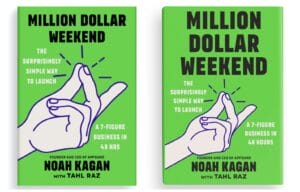
Change in title size
All of these tests and iterations allowed us to get to the final version that people have been loving. 💚
The difference between those who get good results and those who get great results is a commitment to constant asking, testing and improving.
In your business, what’s something you can test and improve?
PS. If you love the cover, you’ll love what’s on the inside of Million Dollar Weekend 😉 I share more about using data to make decisions for your business.
Leave a Reply